
Published by Giovanni Patania
on 05/27/2026
The shared rental market has changed. Where the HMO of a decade ago was sold on price alone, today’s professional sharers expect something closer to boutique living. Run-down rooms with mismatched furniture and a single shared bathroom no longer cut it, and the gap between an average HMO and a premium one is now measured in design choices rather than postcodes.
For landlords, the upside is significant. A property that looks and feels considered tends to attract better tenants, hold them for longer, and command higher rents. Competing on lifestyle rather than cost is now where the smart money in shared housing is going, and the shift from traditional HMOs towards co-living style accommodation reflects that. Here’s how to position your property at the top of the market.
Bathrooms: The ultimate dealbreaker
If a tenant is going to walk away from a viewing, the bathroom is usually why. In most agent and landlord feedback, premium tenants prefer en-suite shower rooms over shared facilities, and many will rule out properties without one before they even book a viewing. Where en-suites aren’t possible across every room, prioritising one or two well-finished private bathrooms tends to pay off more than spreading the budget thinly across shared ones.
Aesthetics matter as much as function. The plastic white “contractor suite” reads as cheap immediately. Matte black fittings, large-format tiles, walk-in showers with rainfall heads, and well-positioned vanity lighting all signal quality without needing a luxury budget.
You don’t always need a full structural overhaul to get there either. Targeted, smart bathroom upgrades like demist mirrors, motion-activated taps, and digital shower controls can refresh an existing wet room and bring it up to a contemporary standard without ripping out the plumbing. For older HMOs, this kind of upgrade often delivers the biggest visual return on investment.

The hotel standard bedroom
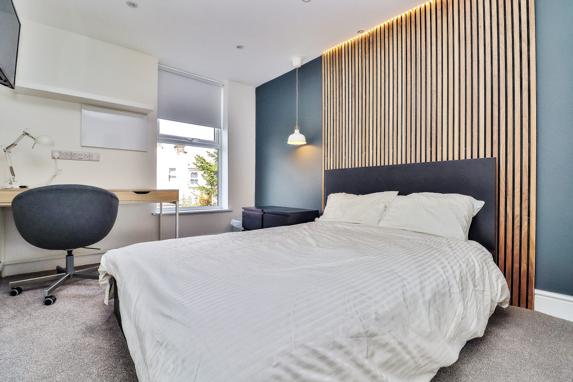
The bedroom has had to evolve. According to the Office for National Statistics, more than a quarter of working adults in Great Britain were hybrid working between January and March 2025, and that figure climbed sharply among professionals and managers. For HMO landlords, this means the bedroom is now also an office, and a flimsy bedside table doubling as a desk no longer passes muster.
A proper ergonomic workspace, even a compact one, makes a real difference. A wall-mounted desk with a comfortable chair, decent task lighting, and easy access to power and data is now closer to a standard expectation than a luxury upgrade.
Where the room is doing double duty as office and bedroom, the design needs to acknowledge that. Even in a small space, creating a visual divide between the desk zone and the rest area helps tenants mentally switch off at the end of the working day. A different lighting circuit for the workspace, a rug that anchors the bed area, or a slim screen or shelving unit positioned between the two can do a lot of work here. It is the difference between a room that feels like an office with a bed in it and a room that feels like somewhere to live.
Storage is the other quick win. Built-in wardrobes free up floor area, look intentional, and remove the need for tenants to bring their own freestanding furniture. In smaller rooms, clever space planning can turn an awkward layout into something genuinely usable, which is often the difference between a room that lets out quickly and one that lingers.

Social spaces that sell
The kitchen-diner is now the social heart of a premium HMO. Tenants want somewhere they can cook properly, eat together, and unwind without retreating to their bedrooms. A galley kitchen tucked behind a closed door no longer works for this market.
Open-plan layouts handle this best, with zoning used to define a relaxed lounge area separate from the cooking and dining zone. A change in flooring, a rug, or a low shelving unit can do the work without putting up walls. Some of the most useful interior design ideas for HMO properties focus on exactly this: making communal areas feel like a place tenants actively want to spend time.
Practical tech matters here as well. Mesh Wi-Fi covering every room properly, integrated USB sockets in kitchens and lounges, and well-placed power points around any communal table are all small details that come up in tenant feedback far more often than landlords expect.
Outdoor space as a differentiator
Outdoor space is one of the clearest dividing lines between an average HMO and a premium one, particularly for hybrid workers spending several days a week at home. Even a modest patio, a courtyard, or a tidy section of garden gives tenants somewhere to take a coffee, eat lunch, or step away from a screen, and that is increasingly something professional renters actively look for.
The bar is not high in terms of cost. Decent paving, a few planters, a small dining set, and proper outdoor lighting can transform a neglected back yard into a genuine selling point. Where possible, a shared bike store or covered seating area adds practical use and pushes the property further ahead of competing listings. For city HMOs without a garden, even a roof terrace or a well-furnished communal balcony can do the same job.
The finishing touches
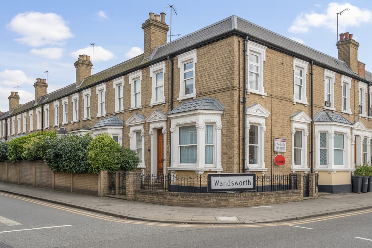
Kerb appeal sets the tone before anyone steps inside. Clean brickwork, tidy bin storage, modern door furniture, and decent external lighting all help shape a viewing’s first impression, and any of them can be addressed without major works.
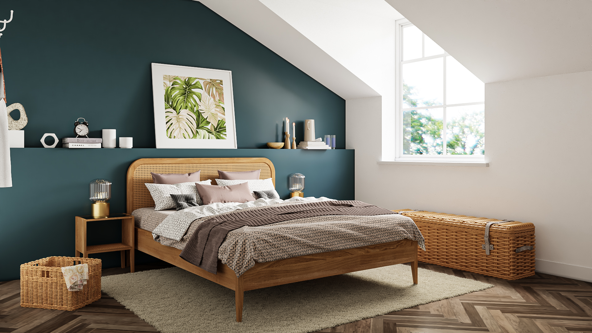
Inside, biophilic touches make a difference out of proportion to their cost. Real or good-quality faux plants, natural materials, and rooms that make the most of available daylight have been shown to support wellbeing through stress recovery and attention restoration, and they’re now consistent features of well-let HMOs where wellbeing has become a genuine selling point rather than a marketing line.
For viewings, staging earns its keep. Fresh linens, a few well-chosen accessories, and a subtle scent give a property the feel of somewhere already lived in well, which is often what tips a tenant from “interested” to “deposit paid” on the same day.
Bringing it all together
Premium tenants pay for an experience, not just a roof and four walls. They’re paying for design that’s been thought about, finishes that hold up, and a property that fits the way they actually live. Getting there doesn’t mean rebuilding from scratch. It usually means picking one or two high-impact areas and getting them genuinely right.
It is worth remembering the practical details that only become obvious once a tenant has moved in. Soundproofing between bedrooms, reliable heating, water pressure that handles back-to-back showers, decent kitchen storage, and a properly designed laundry area all shape the day-to-day experience of living in the property, and any one of them can drive an early move-out if it falls short. These are easy to overlook during a refurb but far cheaper to address then than to retrofit later.
Look at your portfolio honestly and identify the weakest area, whether that is the bathroom, the kitchen, or somewhere the design simply has not kept up. The HMOs that win in this market are the ones that have stopped competing on price and started competing on how a property makes tenants feel about coming home, and the investment usually pays back faster than landlords expect.
Book a property strategy call with our specialists or get in touch for a personalised quote to discuss your specific project and find out how we can help you maximise the value of your HMO portfolio.
Published by Giovanni Patania
on 05/27/2026
Giovanni is a highly accomplished architect hailing from Siena, Italy. With an impressive career spanning multiple countries, he has gained extensive experience as a Lead Architect at Foster + Partners, where he worked on a number of iconic Apple stores, including the prestigious Champs-Élysées flagship Apple store in Paris. As the co-founder and principal architect of WindsorPatania Architects, Giovanni has leveraged his extensive experience to spearhead a range of innovative projects.